An identity for a podcast, where the mark spends its life on a dark photograph
About the client
Thinkers Diary is a podcast about deep conversations, honest reflection and perspective-driven dialogue. We designed the identity and wrote the guide that keeps it consistent across episode art, social, merchandise and the studio itself.
The brief
A podcast identity lives almost entirely on photographs of a dark studio: a condenser mic, low light, a lot of black. A mark that only works on white is useless here, and most of the places it appears are not designed by us: an episode tile, a guest's repost, a cap.
The approach
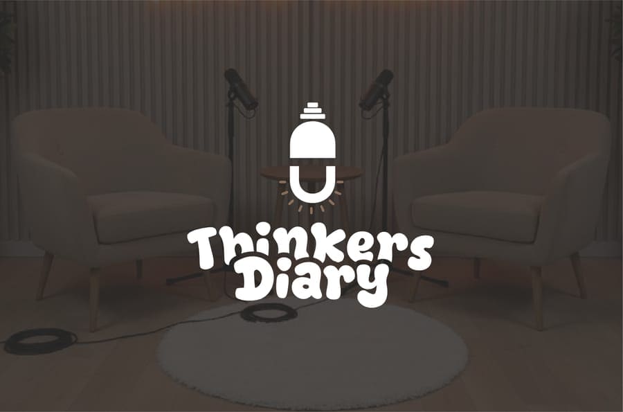
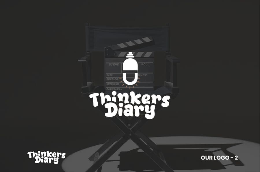
The mark is a microphone drawn as a diary, a capsule mic whose body reads as a bound notebook, so the two things the show is about are one object rather than a symbol beside a word.
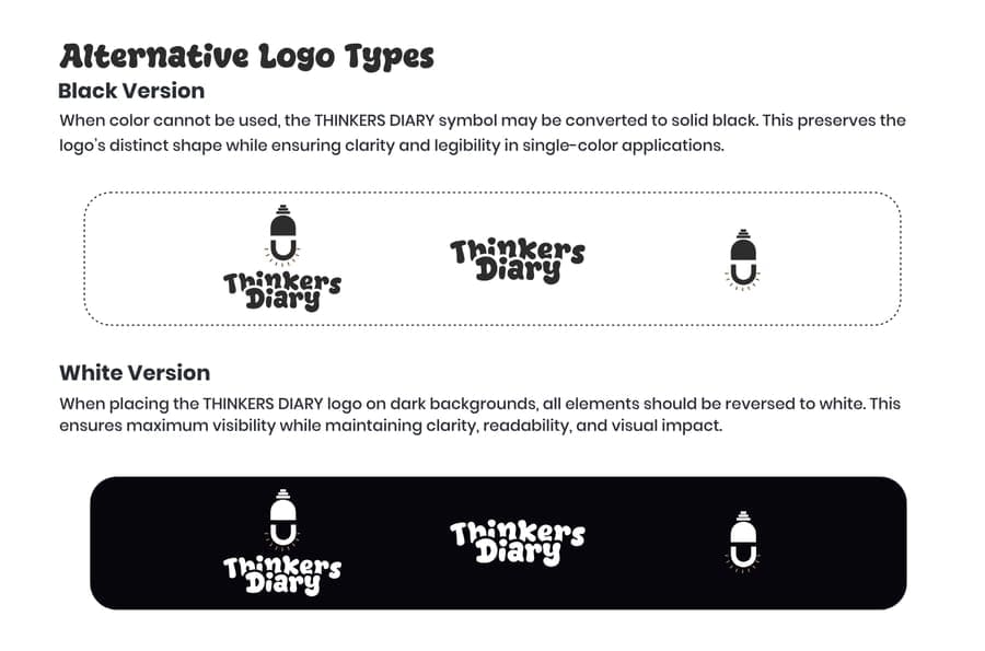
Because it lives on dark photography, the guide leads with the reversed version rather than treating it as an afterthought. There is a black version for single-colour work, a white version for dark grounds, and a page of correct placements over images beside a page of incorrect ones, because on a podcast the person laying out an episode tile at midnight is usually not a designer.
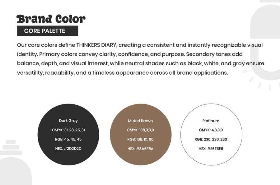
The palette is deliberately narrow: a near-black, a muted brown and a platinum, which is the range a studio photograph already contains. A secondary set of purple, silver and goldenrod exists for promotional material, where the core three would be too quiet.
It is not just about talking, it is about thinking out loud, questioning perspectives, and turning discussions into insight.
What we did
- Primary logo, alternative lockups and a standalone symbol
- Black and reversed white versions for single-colour and dark-ground use
- Correct and incorrect usage pages, worked over real photography
- Core palette and a secondary palette, with CMYK, RGB and HEX for every swatch
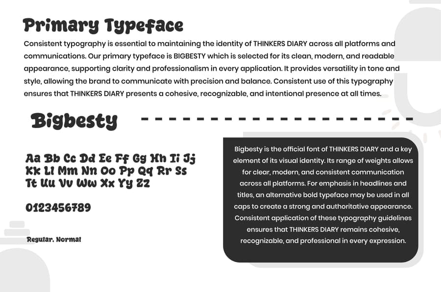
- Typography: Bigbesty as the primary face, Poppins as the secondary
- Brand voice, positioning and personality
- Episode artwork, social and merchandise application
- Studio backdrop and set signage
The palette
- Dark Gray#2D2D2D
- Muted Brown#8A5B3A
- Platinum#E6E6E6
- Rebecca Purple#663399
- Goldenrod#CC9933
The system includes